 AI ORCA
Real build · Mind Grace Therapy
A counselling practice that needed to look as professional as it is.
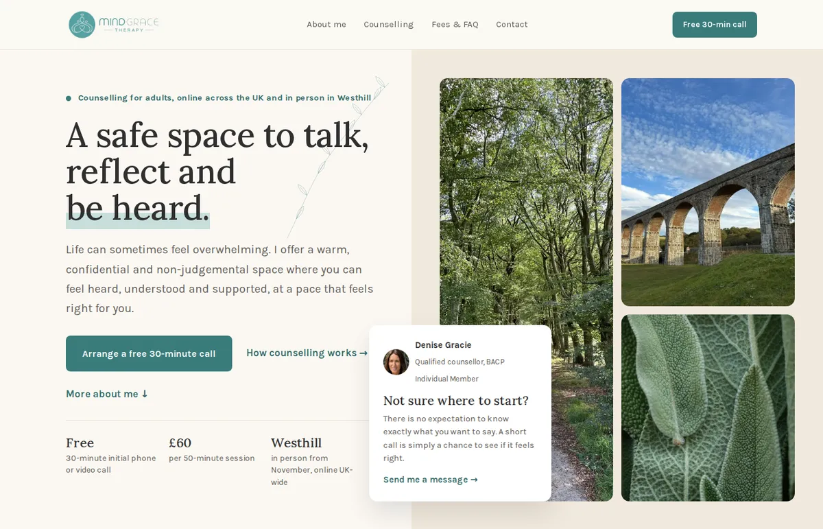
Denise Gracie is a qualified counsellor in Aberdeenshire, seeing adults online across the UK and in person in Westhill. Her first website had only just launched, and she knew it wasn't right: it didn't look like the careful, professional practice she runs. She couldn't say exactly why. We could. We rebuilt all five pages, kept her logo, colours and photos, and put the new site live without touching her email.
The starting point
Someone choosing a counsellor is deciding who to trust.
A person looking for counselling is often at a low point, and they are choosing someone to be open with. They decide quickly, mostly on how the site feels, and a site that feels unfinished makes them hesitate. Denise's first site had the right words, but the way it was put together worked against them.
Before
- A cookie box sat over the first paragraph on desktop and on phones
- The only buttons on the site were the cookie ones
- Each page's title in Google was just its menu label, such as "HOME"
- Headings and text colours fell below the accessibility contrast standard
- Every section looked the same, so it read like one long document
After
- No cookie banner: the site doesn't set tracking cookies
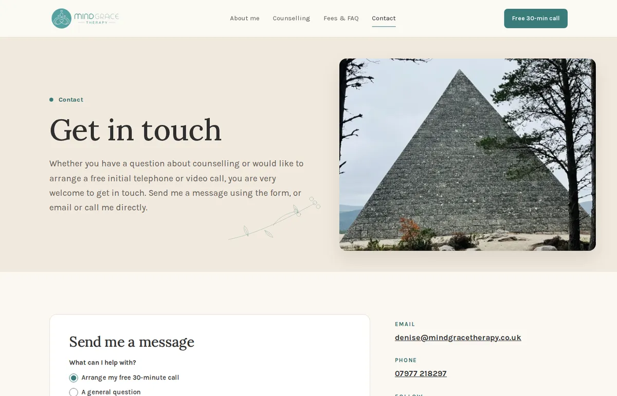
- "Arrange a free 30-minute call" on every page
- Each page has its own title and description, with counselling and her area in them
- Readable text on a calm, light palette that matches her logo
- Clear sections: who she is, how it works, what it costs, how to get in touch
What we built
Fewer things, each doing a clear job.
For a counselling site, calm matters more than clever. Every choice went towards one outcome: a visitor who is unsure can quickly see who Denise is, how it works, what it costs, and how to reach her.
A clear next step
"Arrange a free 30-minute call" sits on every page, with fees and what to expect close by, so nobody has to hunt for how to begin.
A path to Denise
"More about me" at the top leads to "Hello, I'm Denise", then through to her About page. People want to know who they'd be talking to.
A contact form that works
Enquiries go straight to her inbox. She tested it herself the day it went live.
Set up for search
Page titles and descriptions written for each page, a sitemap for Google to follow, and structured details about the practice.
Safety and privacy built in
An urgent-help line (999, 111, Samaritans) in every footer, and a privacy notice written for a service that handles personal information.
Email left alone
Her domain and email stayed where they were. Only the website's address was pointed at the new site, so her mail carried on as normal.
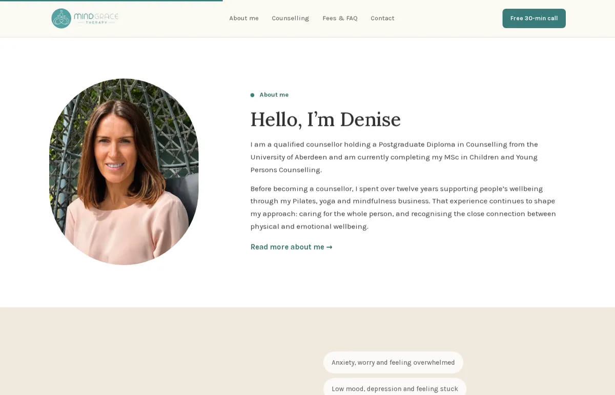
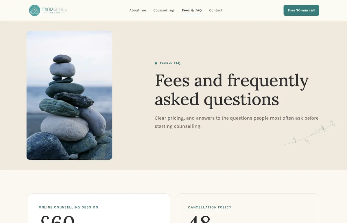
Before & after
Same practice. Same words. A very different first minute.
Drag the handle.

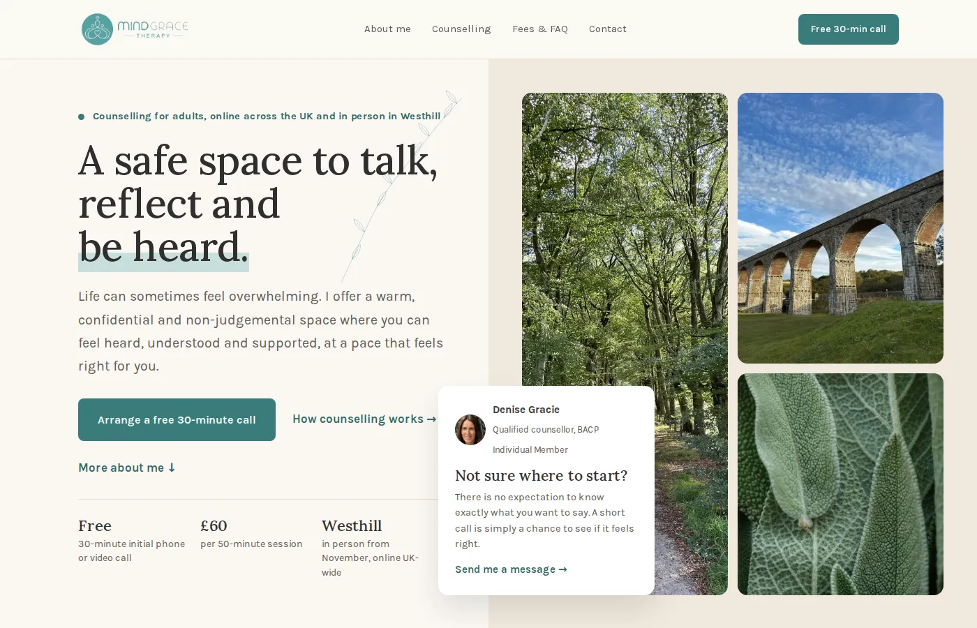 BeforeAfter
 On a phone, the cookie box takes over the screen.
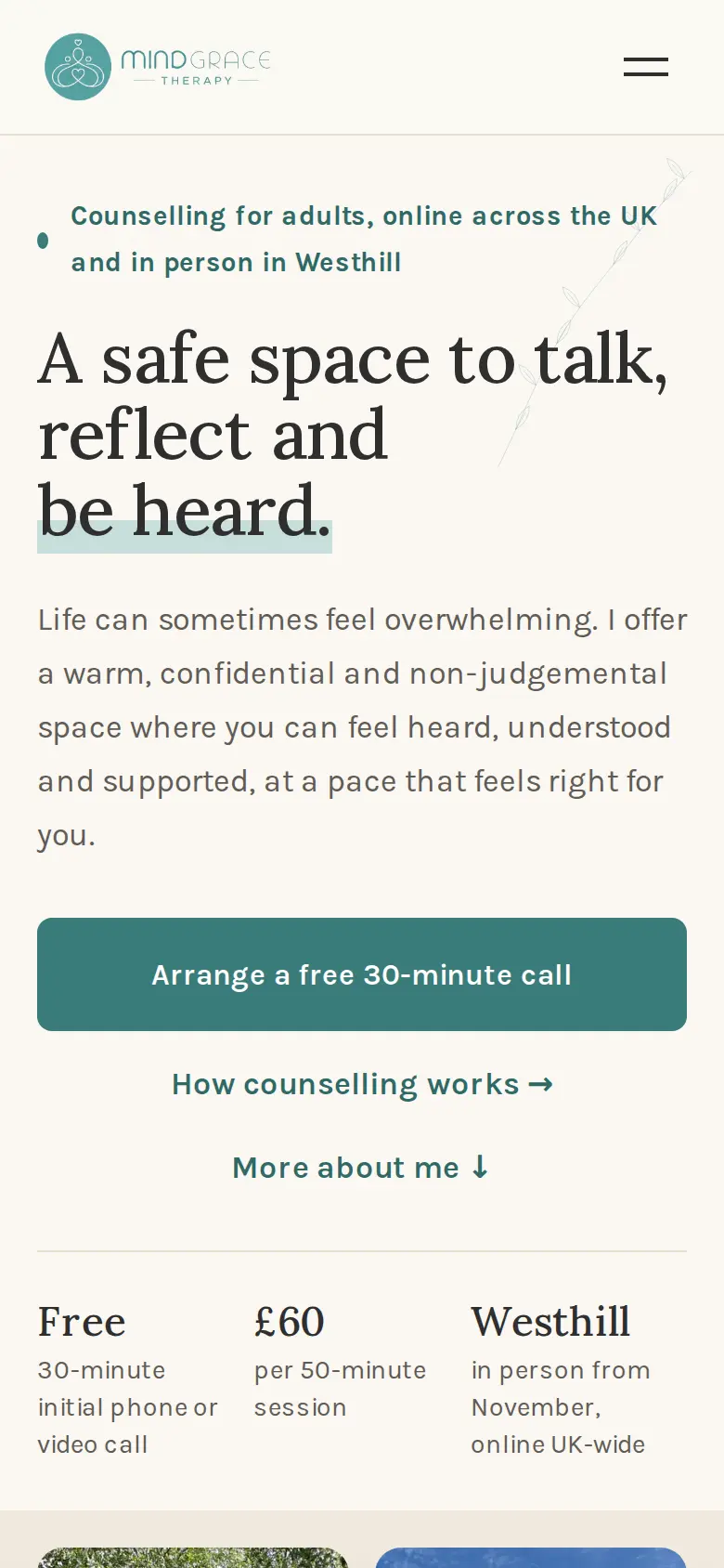 On a phone, the headline and the call button come first.
In her words
What Denise said when it went live.
“Thank you again for such a seamless transition - a slick operation for sure and I will most certainly recommend you to everyone I speak to. You've done an amazing job. I'm over the moon with it.”
— Denise Gracie, Mind Grace Therapy
What changed
What the practice has now that it didn't before.
- A site that looks like the practice. Calm, clear and consistent from the first screen to the footer.
- A next step on every page. The free call is always one click away, on desktop and on a phone.
- Enquiries that arrive. The contact form lands in her inbox, and she confirmed it the day it went live.
- A page Google can read. Each page says what it is and where it is, instead of only "HOME".
- Looked after. Hosting, security and backups are handled, and small changes (like adding her in-person sessions) are a message away.
- Nothing to untangle. Her domain and email didn't move, so nothing about her day-to-day changed.
Got a business that's better than its website?
Send us your site, or just your Instagram, and we'll rebuild your main page properly and send it back as a link. Free, with a note on what we changed and why.